Viator app - Native bookings experience
Overview
Viator, the booking experiences arm of Tripadvisor, had put a lot of effort on having a good e-commerce site. However, the native app needed some love in order to benefit of all the native capabilities and also to don't rely so much on web views. The first step on this process was the migration to native of the whole managing booking experience.
The opportunity: Unveil all the capabilities of a truly native experience to manage your bookings
In trully collaboration with the Product Management team, we identified what needed to be the scope of this:
1. Migration from web view to native of all screens associated with the managing booking flow.
2. Leverage of native capabilities when the users have an upcoming booking.
3. Parallel creation of a Design System to start adding all the common components designed.
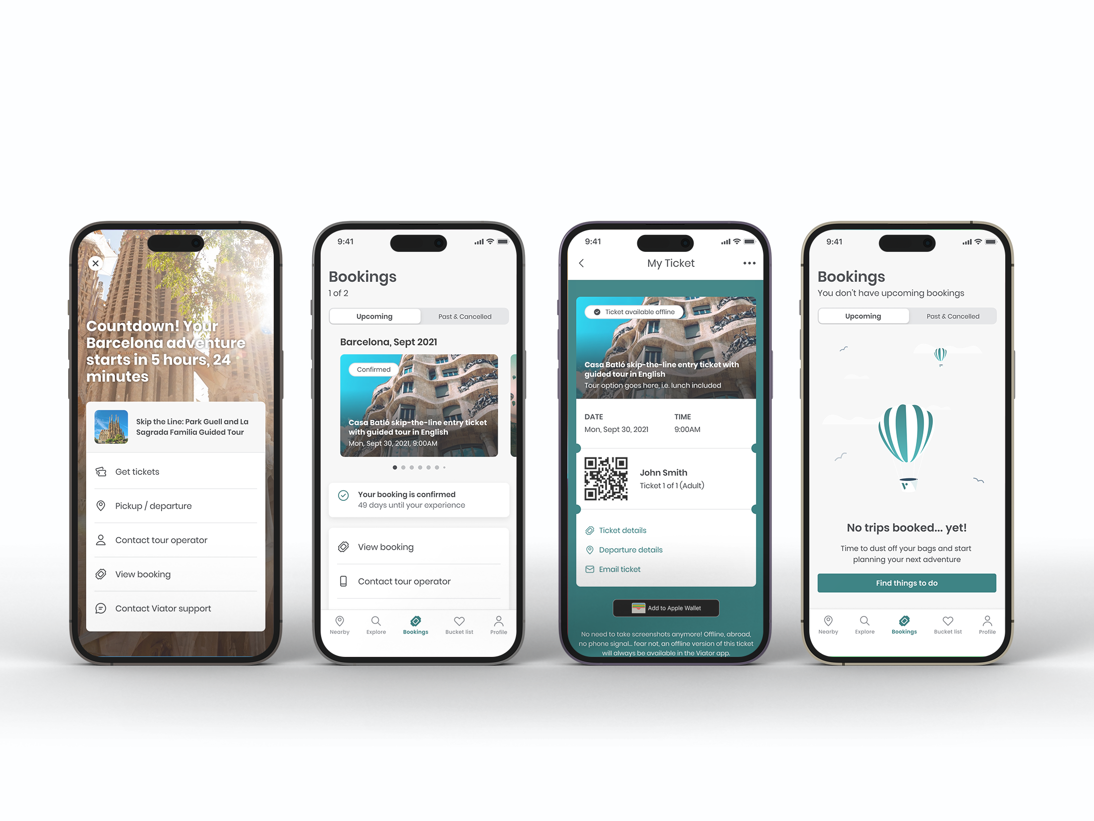
The main pain point raised by users we were trying to solve was allowing them to access their booking without internet connection, as a big bulk of bookings happen for activities to do in a different country, so data services are not always something travellers purchase.

Benchmarking
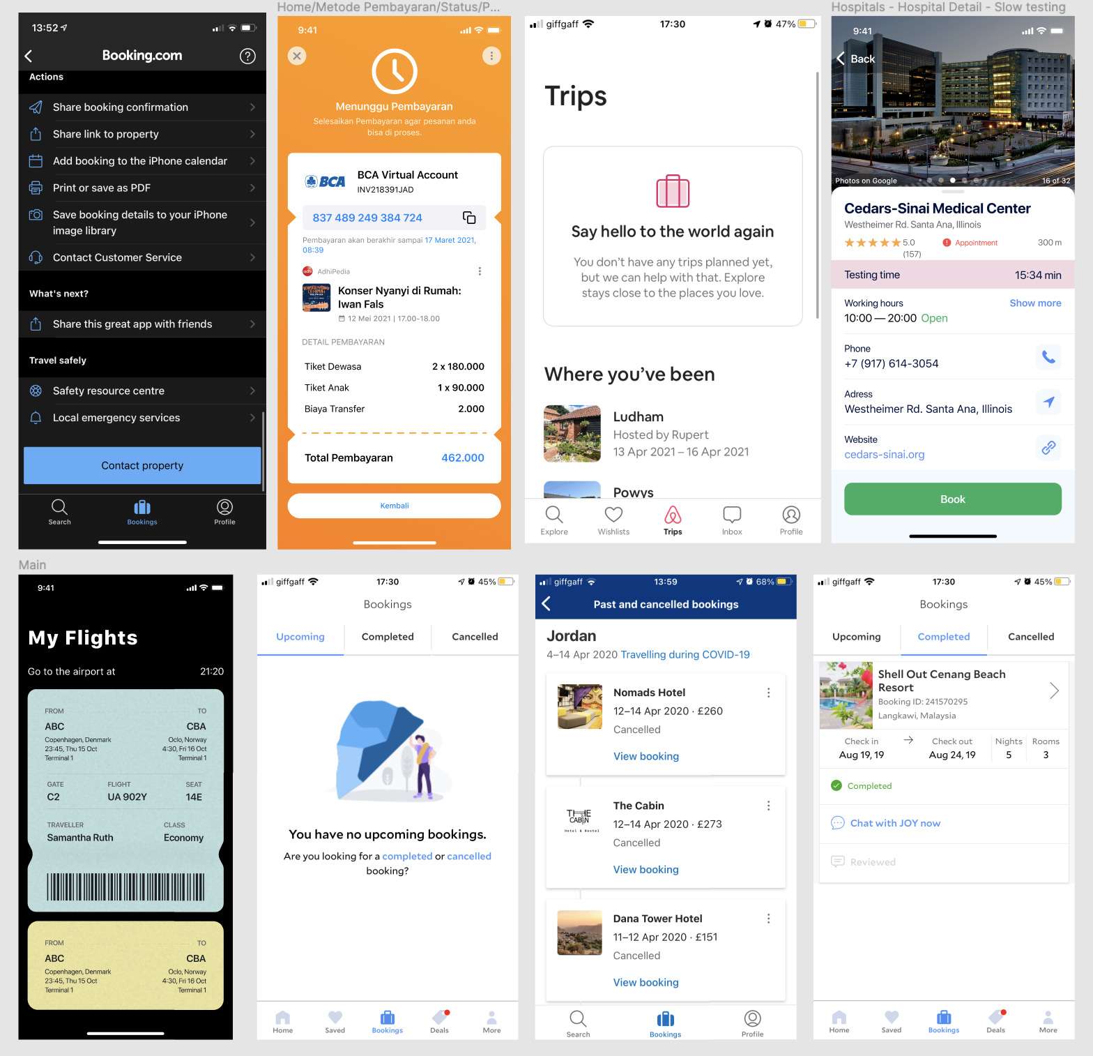
As this problem space was already solved by other big brands, I took some time to research how other e-commerce apps present bookings to the users. I didn't want this to be limited to the travel industry, so apart from the obvious Booking.com, Airbnb, Expedia, etc., I explored apps like ticketing events, flight companies, restaurants bookings, gym apps...

The Process
I partnered with a UX Researcher to get some insights into best practices for booking management usability and UI preferences, as well as more psychological insights into the preferences of users when receiving notifications about their upcoming bookings, what’s important for them at each step of the booking (near departure date, after departure date, etc.).
I created several wireframes and prototypes and worked hand with hand with the Product Manager toward the goals we had in mind for this problem space. This was a very iterative process.
Once a prototype tested well among a set of users, I translated those insights into final pixel-perfect prototypes. I worked with the developers to make all components and interactions as designed.
Solution
The booking management problem ended up being a multi-touch project, as there are several parts of the travel lifecycle where the user interacts with their bookings.
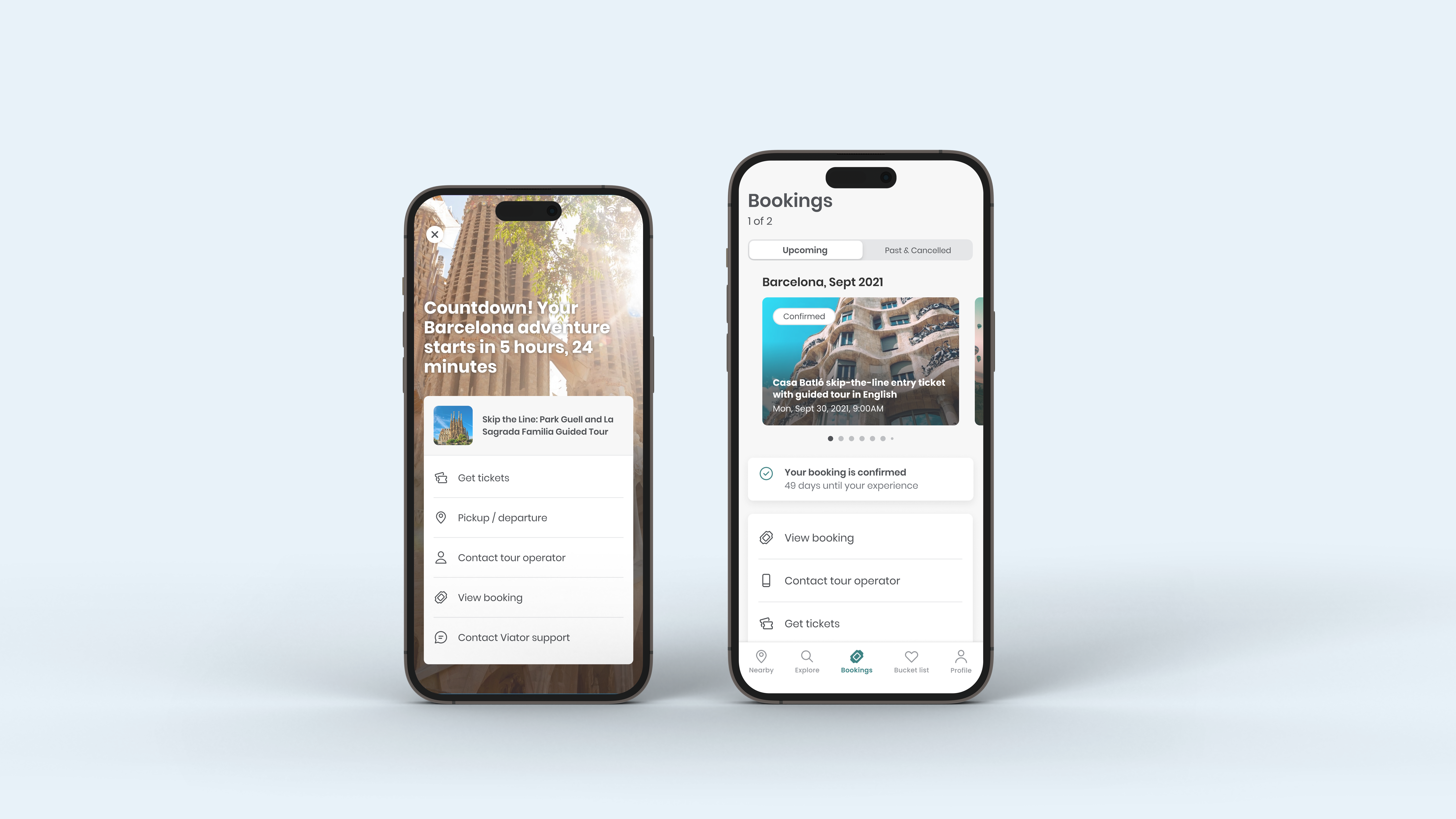
Firstly, once a user has booked an experience, they need to be able to access their booking information as easily as possible. A CRM email with the booking confirmation is also expected, as well as a push notification.
On the run down to the booking date, the user expects some level of reminding in case information change or where pickup/meeting point information is required.
The day of the booking offline access to their ticket was a no brainer, as well as an easy way to interact with the supplier of the experience in case of problems finding their way.
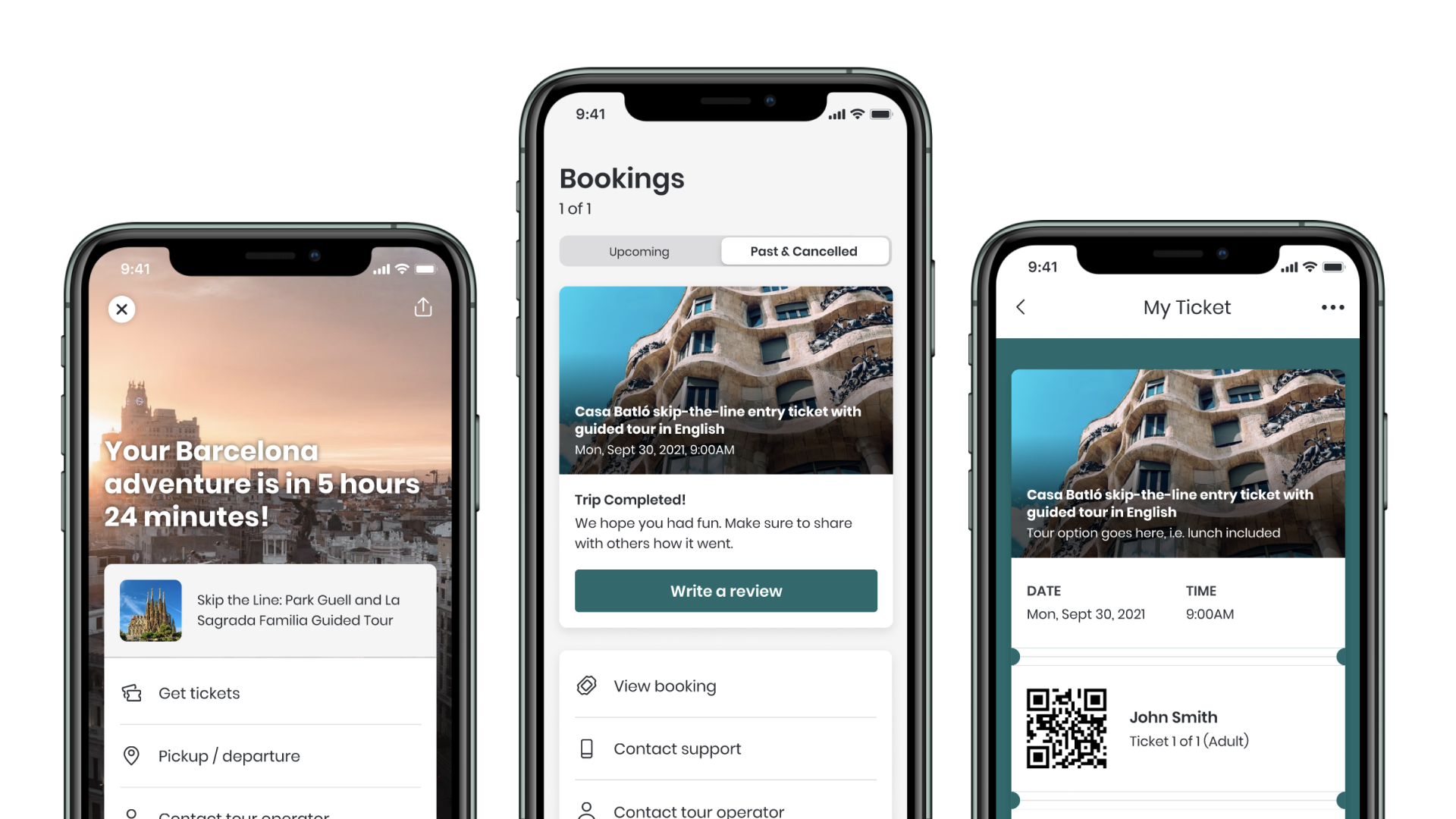
After the experience, easy submission of reviews is also expected, with the reminder via CRM and push.
And something very interesting in this industry is the likelihood to want to see all your past bookings as you collect so many memories, so visually appealing past bookings was also accounted for the project.
Key Features
User-centric Design
Native app design
Viator app – Native bookings experience
This project was designed to help users access their bookings area, in order to better manage their upcoming and past bookings, as well as making offline access to their bookings seamless.
This project was undertaken during my professional employment at Tripadvisor.
Client NameViatorYear2022Linkhttp://www.viator.com


