Viator - Reviews problem space
Overview
Being a Tripadvisor company and an e-commerce site, reviews are a key element to drive bookings.
When a traveler wanted to leave a review after enjoying a travel experience, the form was not optimised for mobile (which was most of the traffic), it didn't allow to upload images and some of the information asked was repetitive, meaning a decent percentage of users abandoned the form before finishing the submission of their review.
This also affected conversion, as products with less reviews are less likely to be booked. So it was a problem that needed to be tackled.
The opportunity: Encourage bookers to engage with the Viator brand throughout the travel lifecycle
In partnership with the Product Manager, we identified that there were two sides to the problem, as we had two personas to cater for:
1. As a review writer, I want to feel like my opinions matter and can make a difference to others, and I want to show recognition to suppliers and give feedback on how to improve.
2. As a review reader, I want to use reviews to help me narrow down the sea of similar options, and validate my product choice by getting social proof & confidence.
By iterating in the review submission and how reviews were shown in the product pages we would be able to address both user problems, making reviews part of several touch points in the travel lifecycle.
Benchmarking
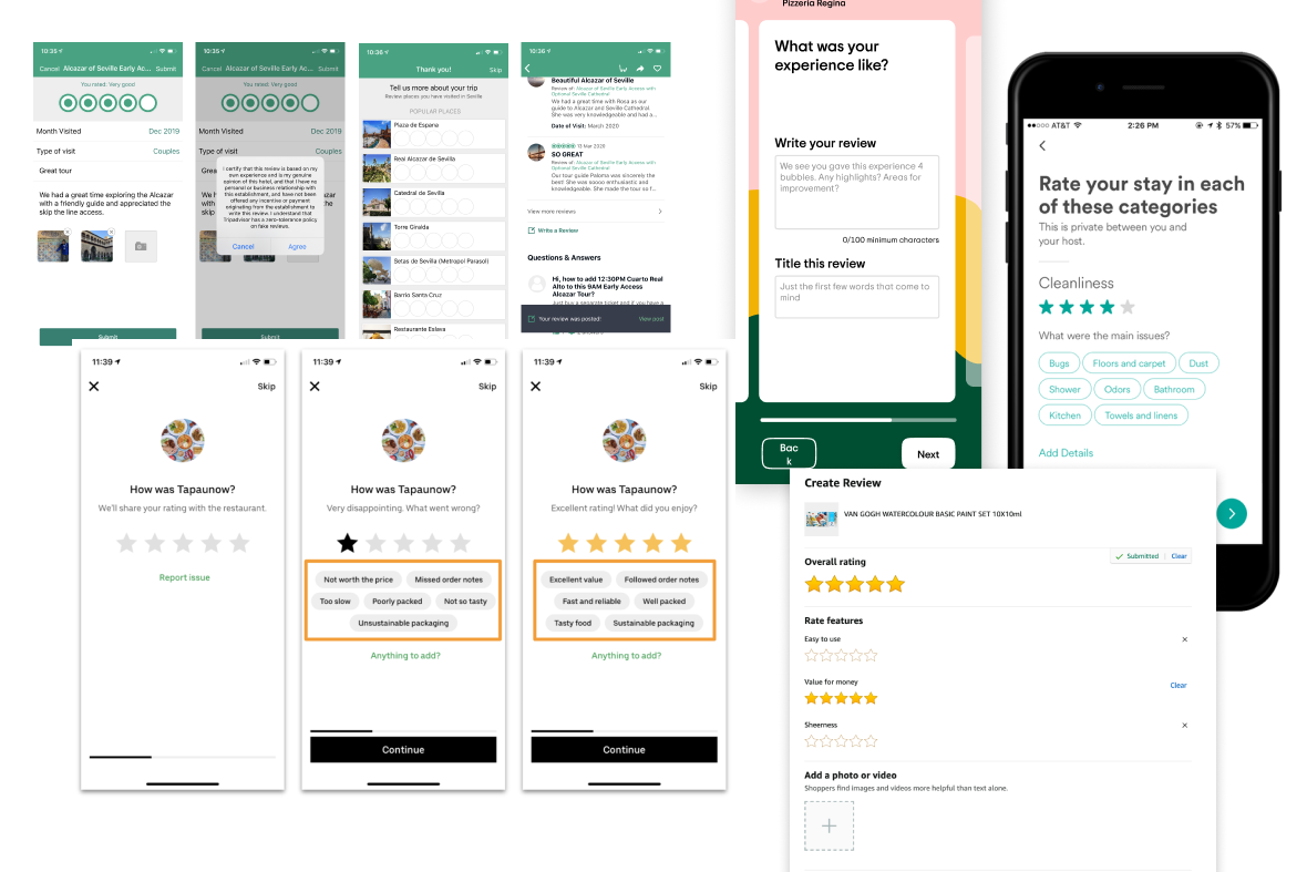
I took some time to research about how other big players in the e-commerce world tackle review submission and presentation. Some of the brands were Tripadvisor, Amazon, Uber, Wayfair, Booking.com, Adidas...
The Process
I partnered with a UX Researcher to get some insights into best practices for review submission usability and UI preferences, as well as more psychological insights into the preferences of users when deciding to book a product based on reviews.
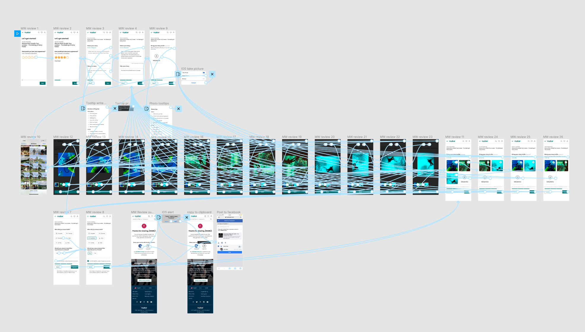
I created several wireframes and prototypes and worked hand with hand with the Product Manager towards the goals we had in mind for this problem space. This was a very iterative process.
Once a prototype that was put to test gave us the results we were expecting in conversion, I translated those insights into final pixel-perfect prototypes and worked with the developer to make all components and interactions as designed. There were a few legacy humps we had to address and we opted to divide the project in two milestones, to be able to get first analytics on the main issues and fine-tune in milestone two.
Solution
The reviews problem ended up being a multi-touch project, as I needed to tackle several parts of the travel lifecycle where the user interacts with reviews.
Firstly, after the user has finished the experience booked, a CRM email to ask to review the product booked was designed, putting emphasis on using a personal touch in copy.
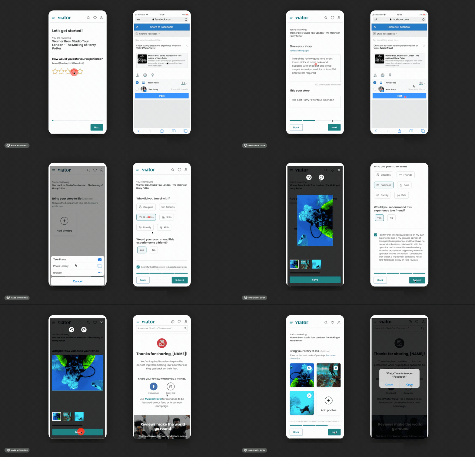
I optimized the review submission form to be mobile-friendly and photo-centric, making sure users could attached photos or videos to the reviews they were submitting in an almost app-feeling way. I also worked hard to cut down the length of the form and the amount of questions asked so the experience was faster for the user.
We added an integration with social media to share your review. And we created a new thank you email and page acknowledging the submitted review.
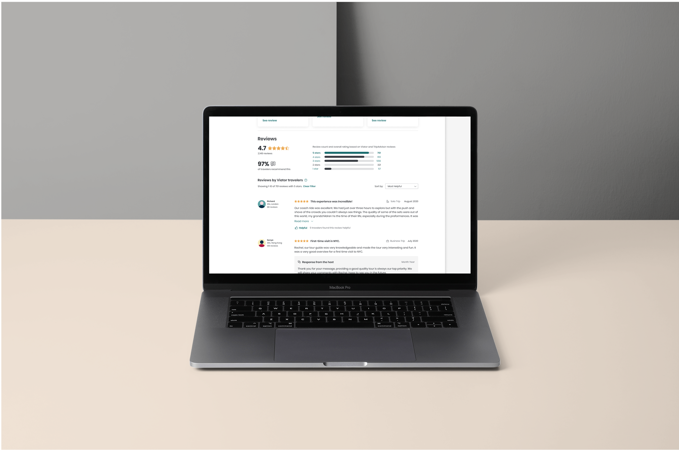
On the other hand, as a review reader interested in booking a product, I redesigned the page to give more importance to the travellers' pictures and videos. We also included social proof with a percentage of travellers who recommended the product, and allowed to filter the reviews by different parameters (number of stars, date of travel, etc.).
In addition to that, we included a vote system where users can thumb up reviews that are particularly useful for them, making finding top reviews easier.
Overall, the amount of reviews with images grew to be 25% of total submissions (from a previous 9%).
Key Features
User-centric Design
Mobile web design
Viator – Reviews problem space
This project was designed to encourage bookers to engage with the Viator brand throughout the travel lifecycle.
This project was undertaken during my professional employment at Tripadvisor.
Client NameViatorYear2020Linkwww.viator.com
