Williams Esports
Overview
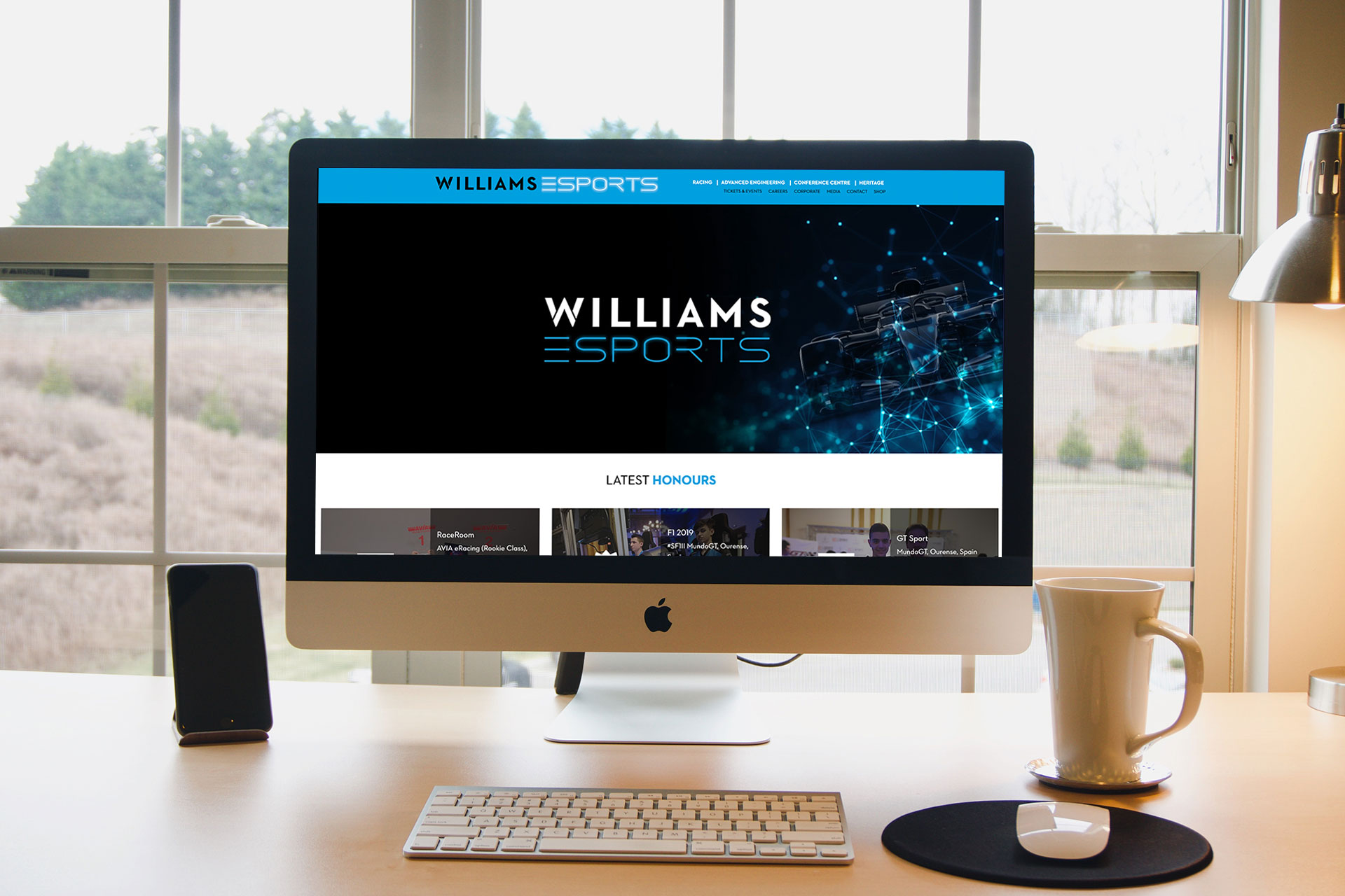
In May 2018 Williams F1 launched an official Esports team to compete in a range of online sim racing competitions. This gave Williams F1 an opportunity to compete in a burgeoning industry, providing both new and existing fans with opportunities to engage with the team in a diverse and accessible arena.
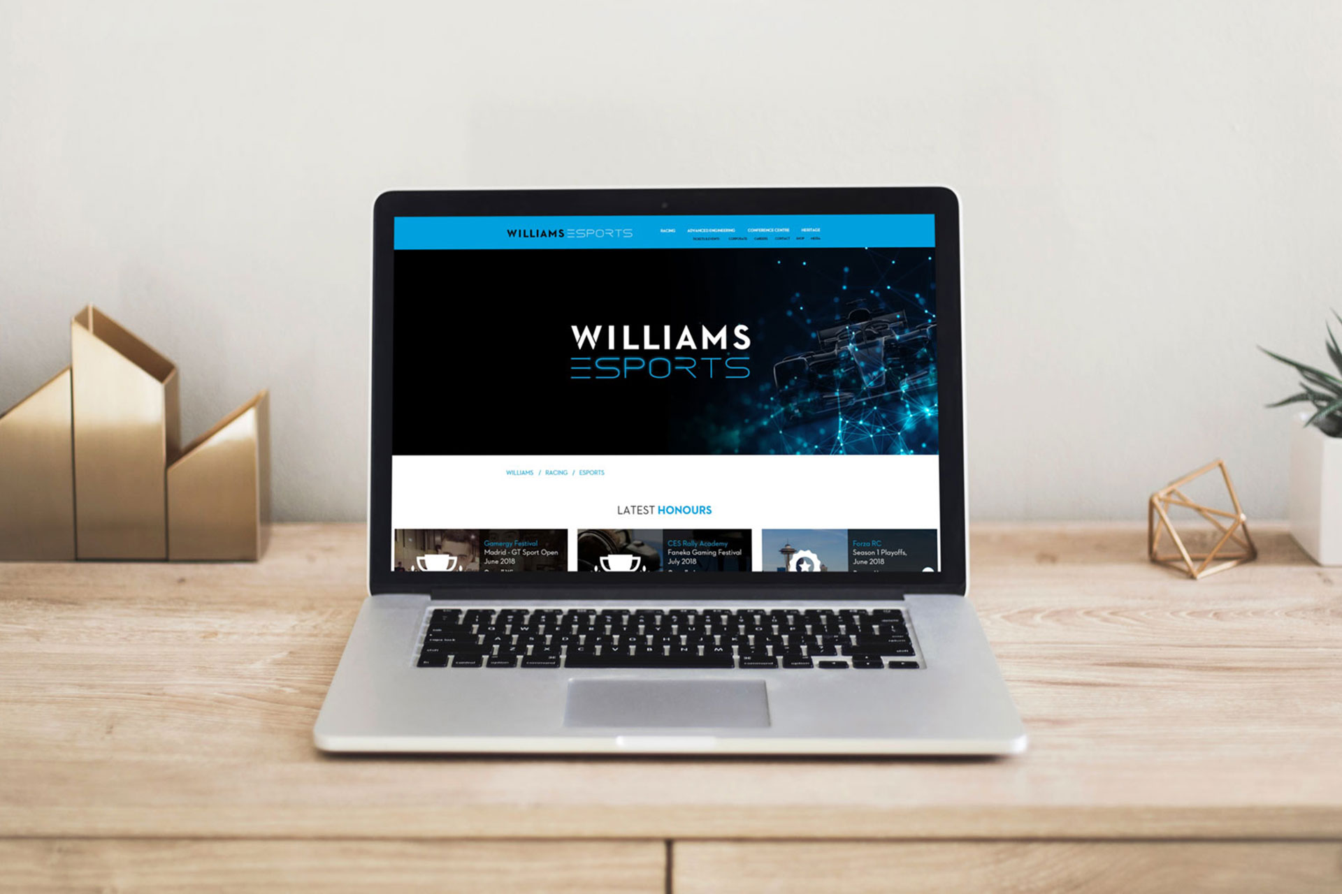
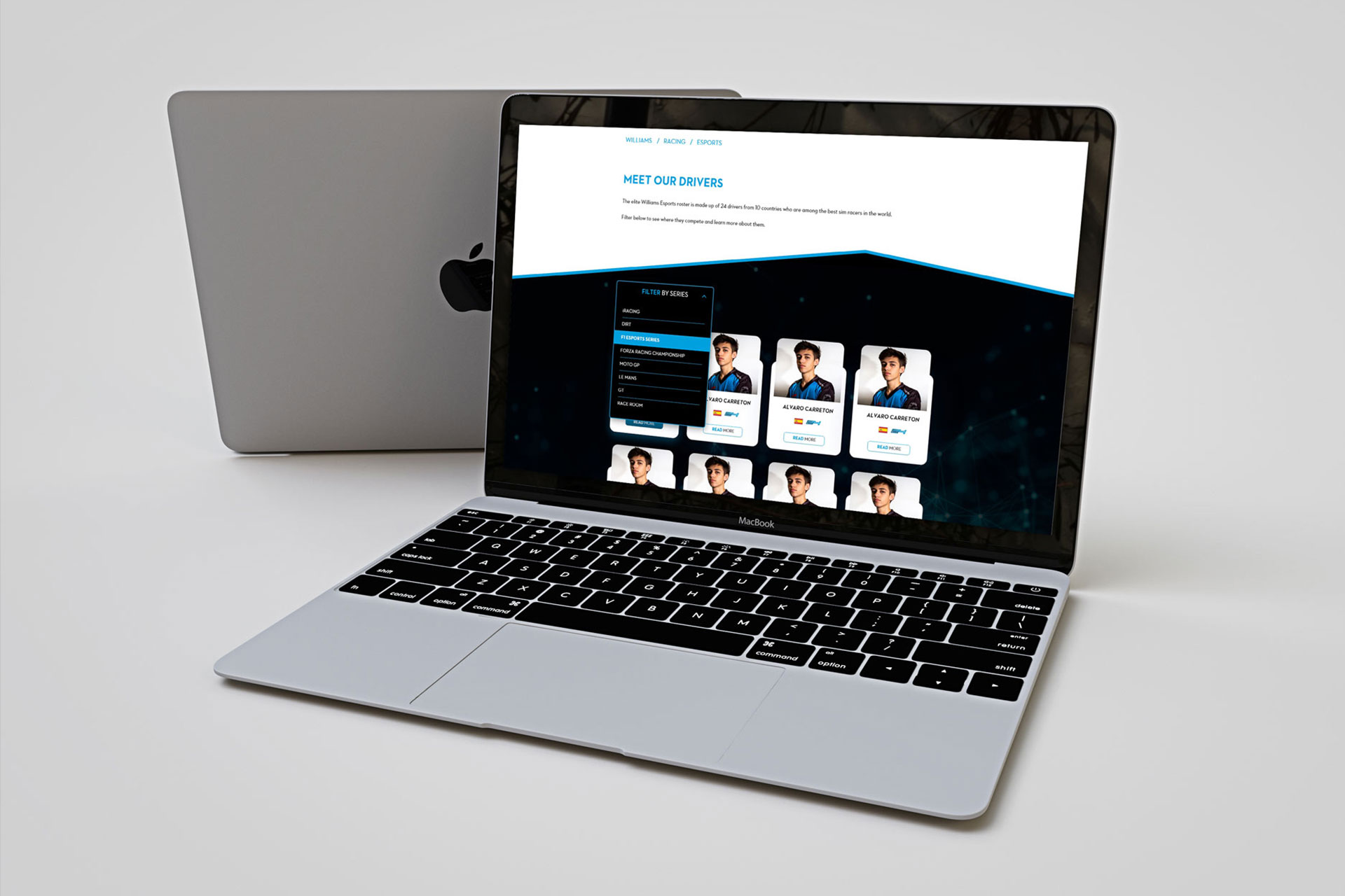
As the Williams Esports roster grew and started to win more and more competitions we felt the need to create a dedicated site for this branch of Williams, in which any user could discover which drivers are part of the team, in which competitions the team participates, which games and series to follow, as well as a window to showcase the partnerships the team is gaining among other brands in the industry.
The problem: Redefining Formula 1 for the Esports world
Being the first of its kind, we had to research into the target audience of this section of the site and organize the design into several sprints that included branding, photography, features or sections of the site, and design guidelines that could be used to extend the experience once the team started to grow.
The users
The Esports landscape is admittedly complex and at times difficult to navigate. Early in the ideation concept and research we noticed the target users of this site were individual players who want sponsorship to be part of a team, and brands associated with Esports technologies (computers, headphones, etc.) who would like partnerships agreements with Williams F1.
The Process
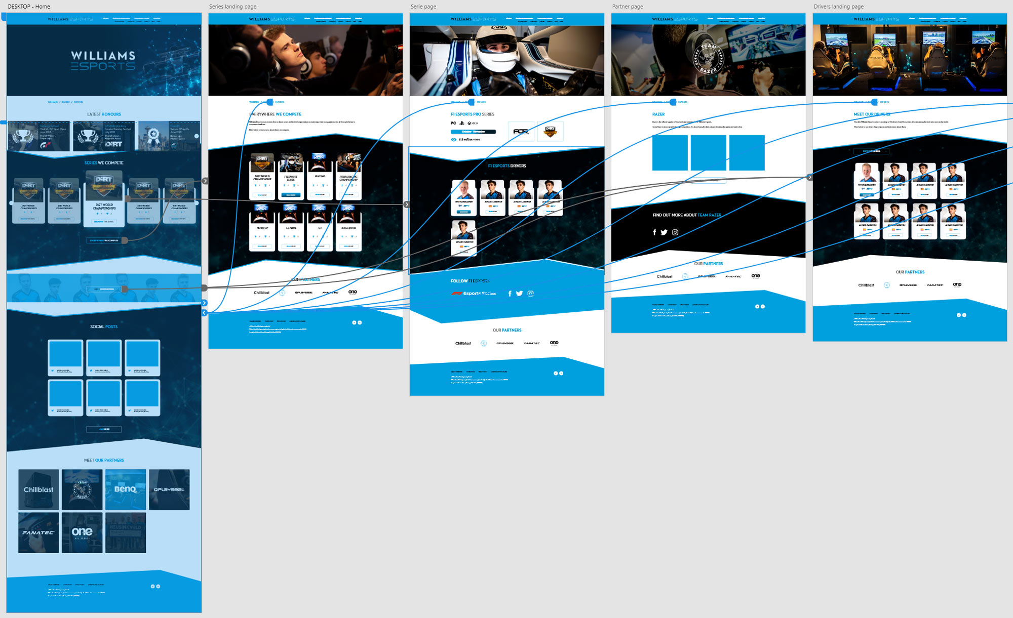
Starting with site navigation and information architecture, I moved onto creating some wireframes as a first proof of concept to be assessed by all stakeholders.
At the same time I conceptualized the brand style and defined the brand elements (such as color palette, text styles, animation styles, etc.).
Once the flows were making sense, I designed some high definition prototypes and started to work with development in order to make the transition from design to engineering smooth (specially in terms of interactions).
The high fidelity prototypes were put to test by some internal users and stakeholders and after some tweaks I created all assets and components.
Solution
The end result is in the one hand an informative site where information around the team players, championships and leagues is available to follow up, and in the other hand a place to showcase the commercial agreements with other brands in the form of partnerships.
As a big chunk of the users of this site were young and active, I opted to introduce some bolder interactions and animations to what the standard Williams brand was used to do, like carousels, parallax, animated hover effects, etc.
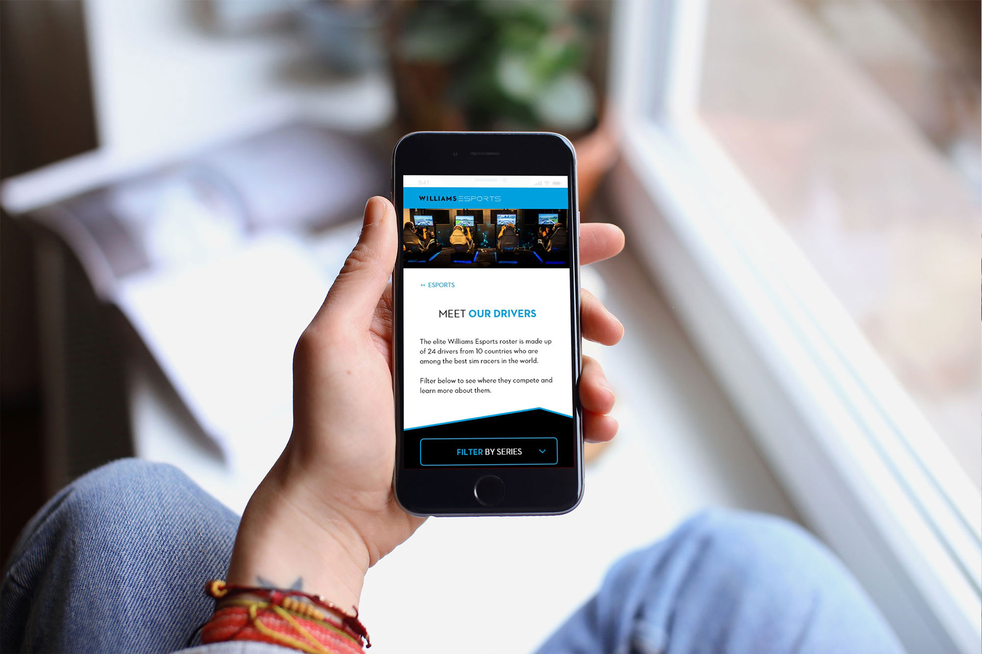
The site was optimized for both desktop and web views.
Key Features
Information Architecture
Wireframing & Prototyping
Williams Esports
I designed a dedicated site for the Esports section of Williams F1. This involved user research, ideation, information architecture, wireframing and rapid prototyping, high fidelity prototyping, imagery curation and efficient handover to development.
This project was undertaken during my professional employment at Williams F1.
Client NameWilliams F1Year2018Linkwww.williamsesports.com
